Jayden’s Juice
Brand Identity Refinement and Packaging Design
Brand Identity Refinement and Packaging Design
Jayden’s Juice is a cannabis tincture brand specializing in high-ratio CBD formulations. Founded by a father seeking options for his son Jayden, who has Dravet syndrome, the company’s personal origins shaped its patient-centered approach and remain central to its identity.
The team approached me with an established brand and four core products, each with its own name and identifying color. They wanted higher-quality packaging that would stand out in a competitive market while communicating the seriousness and care behind the brand.

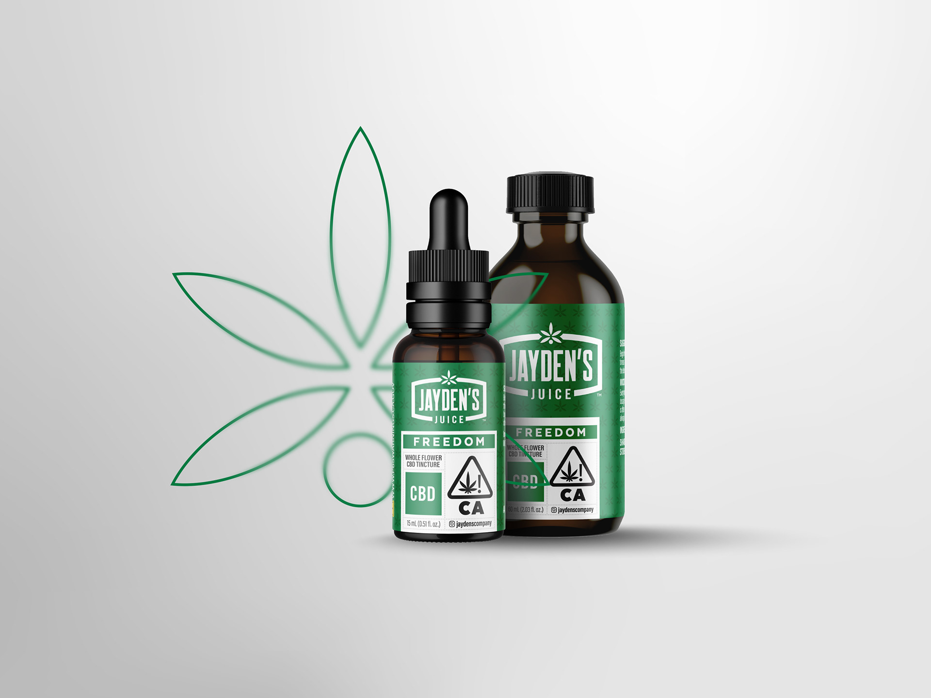
My RoleI developed the refreshed brand lockup and packaging system, prepared all artwork for production, and coordinated with packaging suppliers in China. My responsibilities also included bottle sourcing, ordering, and delivery coordination. As the range expanded, I contributed to naming and color selection for additional products

Finding the Right Direction
My initial concepts explored a substantial departure from the existing identity, using bolder, more playful treatments. Through conversations with the team, it became clear that this approach did not reflect how they viewed the brand or its customers.
The team referred to their customers as patients and positioned its products around therapeutic use. That perspective shifted my direction toward a cleaner, more serious presentation informed by wellness and supplement packaging.
The goal was to retain a recognizable cannabis identity while creating the considered appearance of a product that could sit comfortably in a wellness retail environment.

Refining the Identity
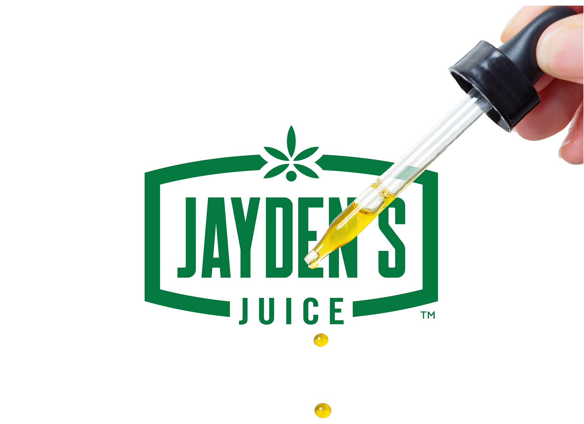
I retained the existing flower symbol as the focal point and developed a bracket-style frame to bring it together with the wordmark in a cohesive badge.
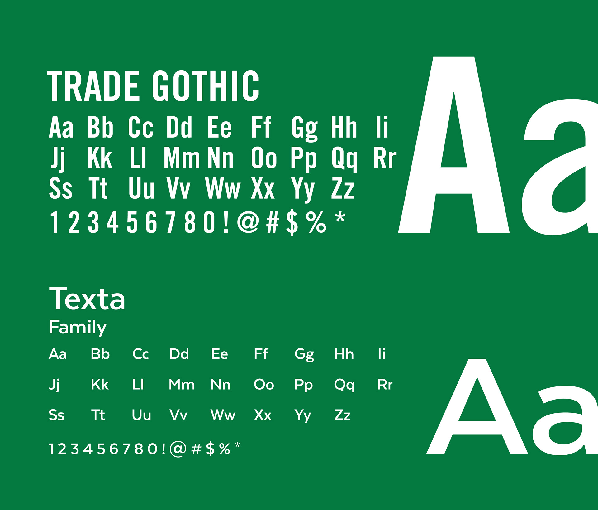
Robinson gave “JAYDEN’S” a strong headline treatment, supported by Trade Gothic for subheadings and Texta for supporting copy. This hierarchy established distinct roles for the brand name, product information, and explanatory text.
The refreshed lockup preserved a familiar brand asset while giving the identity a stronger structure for packaging applications.

Designing for Expansion
The four original products already had established names and corresponding colors. I carried those identifiers into a uniform packaging system, using consistent brand placement, typography, and layout to connect the range while keeping each formulation distinguishable.
Expansion was part of the design thinking from the beginning. New products could enter the range through changes to color and product information without requiring a new design approach. I later contributed to naming and color decisions as additional products were developed.

Working Across Materials
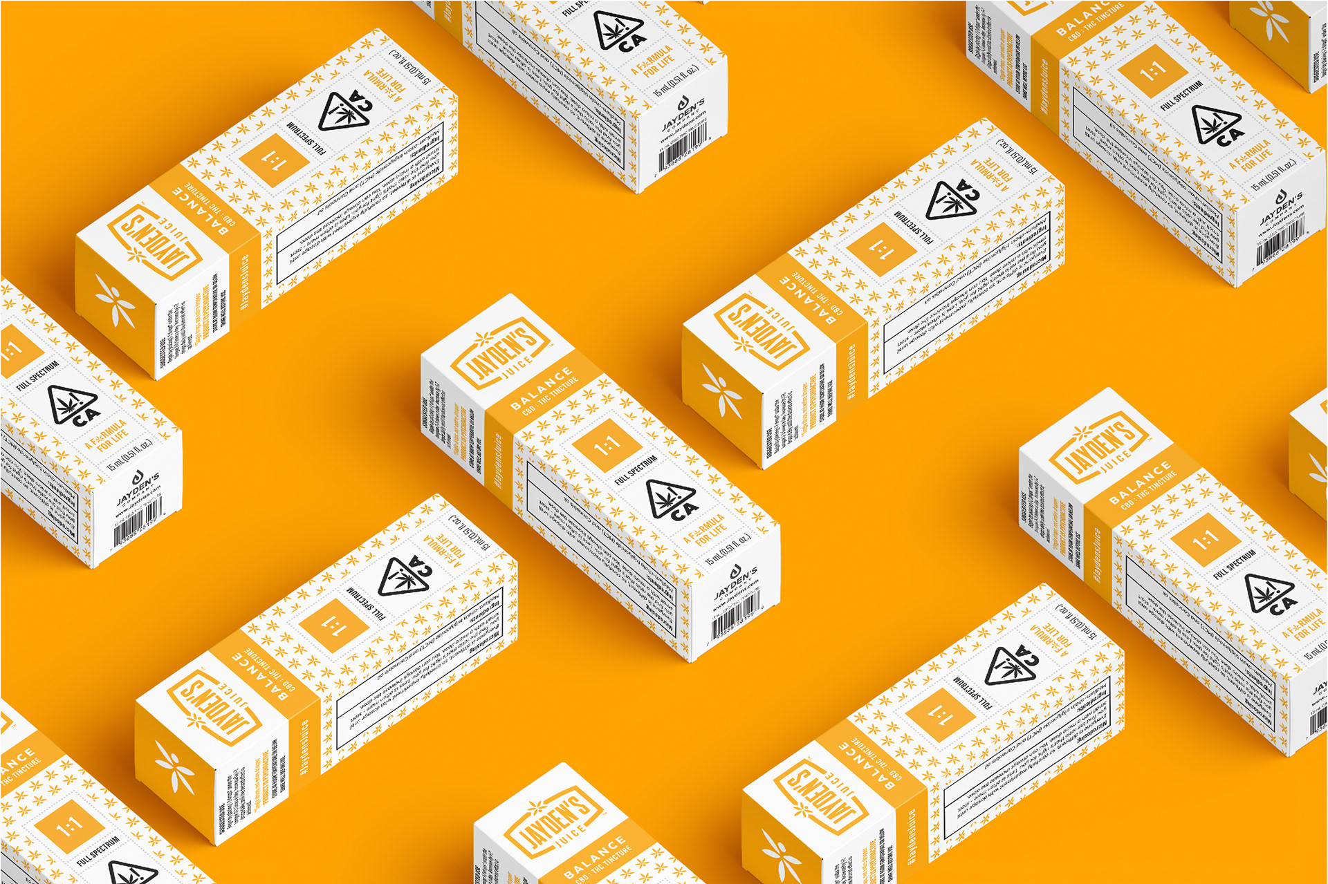
Production required attention to how the brand colors reproduced across different surfaces. Yellow, in particular, appeared differently on matte-laminated labels and uncoated cardboard carrier boxes.
The matte laminate was selected to improve label durability around the oil-based product. To bring the colors closer across substrates, I requested multiple rounds of production photographs and worked with the supplier to assess differences and guide adjustments.
I also developed a more premium packaging option incorporating spot varnish for added visual and tactile contrast. Although that treatment was outside the available budget, exploring it helped establish the options before moving forward with a more economical execution.
Final Execution
The completed system gave Jayden’s Juice a consistent presentation across its product range, with a flexible structure for expansion and packaging decisions grounded in both brand positioning and production needs.


All designs shown in this project were produced. The gallery primarily features actual product photography, supplemented by digital mockups.